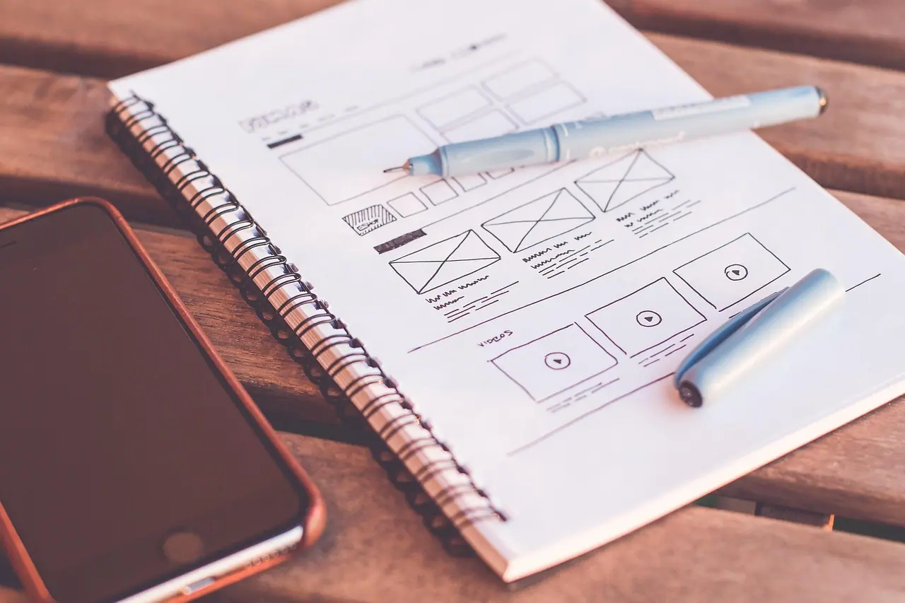
The identity is a toolkit for being recognised
An identity has one job above all: to make the brand quick to recognise and hard to confuse. Beauty helps. Expressing the strategy helps. But an identity that is admired and not remembered has failed at the part that pays.
That is why modern brand identity design is better understood as a system than as a logo. People rarely see a logo in isolation. They see a social post, a delivery box, an app screen, a sales deck or a banner in a busy feed. Recognition comes from the combination of cues — a colour, a shape, a typeface, a way of cropping photographs — repeated across all of them.
Design the system for the thousandth use, not for the launch presentation.
The components of an identity system
Fig. 01 · Stack
Tap to explore
Layers of a brand identity system
Applications
Website, packaging, social templates, signage, documents, product UI
Expressive elements
Imagery style, illustration, iconography, motion, sound, graphic devices
Core assets
Logo, colour palette, typography, voice principles
Strategic foundation
Positioning, personality and the idea the identity must express
Core assets are the elements used everywhere: the logo and its variants, the primary and secondary colours, the typefaces and the principles of voice. Expressive elements give the system range so it does not become repetitive: photography direction, illustration, icons, patterns and motion behaviour. Applications are where the system meets the real world, and they are the true test of whether it works.
Distinctiveness: the quality that matters most
An identity can be appropriate, modern and well crafted and still be generic. The danger is greatest when a whole category draws on the same references: the same blues for finance, the same greens for wellness, the same rounded sans-serifs for technology. Fitting in feels safe and makes the brand invisible.
Distinctive assets are elements that, over time, become linked to one brand so strongly that they trigger it on their own. You cannot declare an asset distinctive; it earns that status through consistent use. What you can do is choose candidates that are unusual within your category, simple enough to repeat, and flexible enough to appear in many formats. Then use them for years.
Scoring an identity before you commit
Identity decisions are often made by taste in a single meeting. A simple scorecard slows that down and makes the debate about criteria rather than preference. Weight the criteria according to your situation; the weights below show relative emphasis for a typical growing brand, not measured data.
Fig. 02 · Scorecard
Tap to explore
Criteria for judging an identity
Bars show relative emphasis, not measured data
How an identity project runs
- 01Brief from strategy. Translate positioning and personality into design principles: ‘precise but warm’, ‘confident but not loud’. See brand strategy.
- 02Audit the category. Lay out competitors’ identities side by side to see what is conventional and where there is room to be different.
- 03Explore territories. Develop two or three distinct creative routes, each shown in real applications rather than as a logo on a white page.
- 04Choose and refine. Select one route against the scorecard, then develop it into a complete system.
- 05Test in use. Apply the system to the hardest formats — tiny screens, busy feeds, regional language layouts — and fix what breaks.
- 06Codify. Write brand guidelines and build templates and asset libraries.
- 07Roll out. Prioritise the most visible touchpoints and replace the rest in a planned sequence.
The single most common failure in this process is reviewing logos without context. Ask to see every route on a homepage, a social post, an invoice and a product label. Decisions improve immediately.
Designing each core asset
Compare scenarios
What good looks like for each asset
Simple enough to draw from memory, distinctive enough not to be confused, with variants for every size.
- Primary lock-up, stacked version and a compact symbol
- Defined clear space and minimum sizes
- Tested in one colour for embossing, stamps and favicons
- Detail in the logo design process
A palette with clear roles, not a list of swatches.
- One or two ownable primary colours
- Supporting neutrals for text and backgrounds
- Contrast-checked combinations for accessibility
- Values for screen and print
Usually a display face for character and a text face for reading.
- Licences that cover web, app and print use
- Support for every script you publish in
- A clear hierarchy of sizes and weights
- See typography for brands
The elements that carry personality day to day.
- Photography direction: subject, light, cropping, colour
- Illustration and icon style
- Voice principles with do and don’t examples
Identity for digital-first brands
For many companies, the identity now lives mainly on screens: in apps, feeds, marketplaces and messaging. That changes the priorities. Motion becomes a core asset, because a brand that moves in a recognisable way is identified faster in video. Small-size performance matters more than the full lock-up. Templates matter more than master artwork, because most assets are produced quickly by many hands.
Larger organisations often formalise this as a design system, connecting brand assets with product interface components so the app and the advertising feel like the same company.
Evolving an identity without losing recognition
Most established brands do not need a new identity; they need a better-managed one. The question is which assets carry recognition and must be protected, and which are tired or underperforming and can change. Changing a strong asset destroys equity; keeping a weak one wastes an opportunity.
Run an inventory of every recurring element and ask customers which they associate with you. Elements that are both well known and clearly linked to your brand are the ones to keep, even if the team finds them dated. Elements that are rarely noticed can be refined or replaced with little risk. This is the logic behind most careful refreshes, and it is the first question in any rebranding decision.
Whatever you change, change it in one coordinated move with a clear date, and retire the old assets deliberately. A slow, uneven transition leaves the market looking at two brands at once, which is the most expensive outcome of all.
Checklist before you sign off an identity
Checklist
0/10Identity sign-off checklist
Key takeaways
- 01A brand identity is a system of recognition cues, not just a logo.
- 02Distinctiveness within the category is the quality that most often decides whether an identity pays back.
- 03Review identity routes in real applications, never as logos on a white page.
- 04Score options against criteria to move the debate beyond taste.
- 05Templates and guidelines determine whether the identity survives everyday use.
Frequently asked
- What is brand identity design?
- Brand identity design is the creation of the visual and verbal system a brand uses to be recognised: logo, colour, typography, imagery, iconography, motion and voice, along with the rules for combining them. Its purpose is to express the brand strategy and make the brand distinctive and consistent across every touchpoint.
- What is the difference between brand identity and brand image?
- Brand identity is what the company creates and controls: its name, design system and voice. Brand image is what people actually perceive. The identity is designed to shape the image, but the image is also formed by experience, word of mouth and competitors, so the two can differ.
- What are the key elements of a brand identity?
- The key elements are the logo and its variants, a colour palette with defined roles, typography, imagery and illustration style, iconography, graphic devices, motion principles and the brand voice. Guidelines and templates make these elements usable by many different people.
- How do you make a brand identity distinctive?
- Study what is conventional in your category and deliberately depart from it where it does not harm clarity. Choose a small number of unusual but simple assets — a colour, a shape, a typographic style — and use them consistently for years. Distinctiveness is earned through repetition, not declared at launch.
- Should a start-up invest in a full identity system?
- A start-up needs a sound core rather than a full system: a clear logo, a limited palette, one or two typefaces and basic voice principles, all derived from a clear position. Expressive elements and detailed guidelines can be added as the company grows and more people produce assets.
Published by Fabulous.Media, a network of specialist marketing agencies. Updated 9 October 2026. Platform features change often; check current official documentation before acting on platform-specific detail.