Type is the most-used brand asset
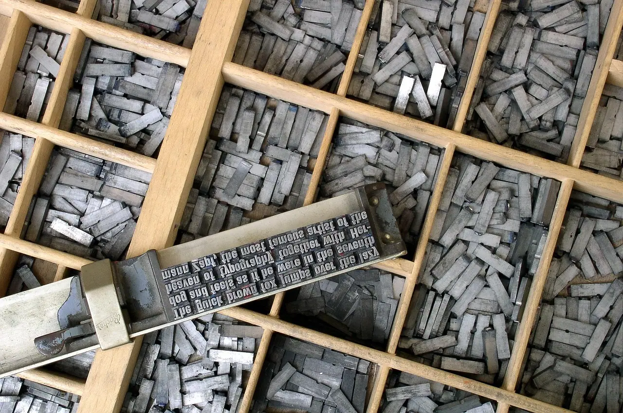
A logo appears once on a page. Typography appears in every word: headlines, product names, buttons, prices, legal text, captions and subtitles. That makes type the brand asset people see most often, and one of the most powerful carriers of personality, even when they do not consciously notice it.
Typography for brands has two jobs that pull in different directions. It must be distinctive enough to feel like the brand and readable enough to communicate without friction. Most brand type systems resolve this by assigning the two jobs to different typefaces and defining exactly where each is used.
Readers forgive a plain typeface; they never forgive one they cannot read.
The layers of a brand type system
Fig. 01 · Stack
Tap to explore
How a type system is built
Display face
Headlines and short statements; carries most of the personality
Text face
Body copy, interfaces, documents; optimised for reading
Hierarchy and spacing
Sizes, weights, line lengths and line spacing for each role
Fallbacks and scripts
System fonts and companion faces for every language and platform
Some brands use one versatile family for everything, relying on weights and sizes to create contrast. Others commission a custom typeface to own a fully distinctive voice. Both are valid; the choice depends on budget, the importance of type to recognition and the range of languages and platforms involved.
How to choose brand typefaces
Fig. 02 · Scorecard
Tap to explore
Criteria for selecting a brand typeface
Bars show relative emphasis, not measured data
Start from personality. Translate the traits in the brand strategy into typographic qualities: geometric shapes feel rational and modern; humanist forms feel warm and approachable; high-contrast serifs feel refined; heavy, condensed faces feel urgent and loud. Then shortlist faces that express those qualities and test them with real content — not placeholder text or the brand name alone.
Check the category. If every competitor uses a similar clean sans-serif, choosing another one makes the brand harder to distinguish. A different display face, or a distinctive treatment of a standard face, can become a recognisable asset over time.
Serif, sans-serif and beyond
Compare scenarios
Typeface categories and what they tend to signal
Letterforms with small strokes at the ends. Often read as established, editorial or refined.
- Strong for headlines and long-form reading in print
- Modern serifs can feel contemporary, not only traditional
- Check rendering at small sizes on screens
Clean letterforms without serifs. Often read as modern, direct or neutral.
- The default for interfaces and digital products
- Very crowded territory; distinctiveness is harder
- Humanist, geometric and grotesque styles feel quite different
Faces designed for large sizes and strong character.
- Can become a signature asset
- Use sparingly — headlines and short lines only
- Never for body text or interfaces
A typeface drawn for the brand.
- Maximum distinctiveness and control
- Can solve licensing and multi-script needs at once
- Significant investment in design and maintenance
These associations are tendencies, not rules. Context, weight, spacing and colour change how any face is read. Always judge type in the brand’s real layouts.
Building the hierarchy
A type system is more than a font choice. Define the roles — display headline, section heading, subheading, body, caption, button, label, legal — and give each a size, weight, line spacing and maximum line length. Express sizes as a consistent scale rather than arbitrary values; this makes layouts feel orderly and makes it simple to encode the system as design tokens in a design system.
- Line length. Body text is most comfortable to read at a moderate number of characters per line. Very long lines tire the eye; very short ones break the rhythm.
- Line spacing. Body text needs more generous spacing than headlines. Tight headlines and loose body copy is a common, effective pattern.
- Contrast. Make the difference between levels obvious. Two sizes that are almost the same look like a mistake.
- Weight discipline. Use a small number of weights consistently. Many weights on one page create noise.
Multilingual and multi-script brands
Brands that communicate in several languages need typefaces that cover every script, or companion faces designed to sit comfortably beside the primary one. In India, this may mean Latin plus Devanagari and one or more regional scripts; in other markets, Arabic, Cyrillic or East Asian scripts. A Latin face paired with a mismatched system font for other scripts makes regional communication feel second-class.
Check character sets as well: currency symbols such as ₹, accented characters for names, and numerals that work in tables. Test right-to-left layouts if relevant. Many type foundries offer families with broad script support, but quality varies across scripts, so review each with native readers.
Licensing: the unglamorous essential
Fonts are software, licensed rather than owned. A licence that covers desktop use may not cover embedding on a website, in an app, in video or in documents shared with partners. Licence terms differ by foundry and change over time, so read them and check current terms before committing.
Checklist
0/9Typography licensing and rollout checklist
Typography and accessibility
Readable type is accessible type. Use sufficient size for body text, strong contrast between text and background, generous line spacing and clear distinctions between similar characters. Avoid setting long passages in all capitals or in light weights on coloured backgrounds. Accessibility guidance applies to marketing pages as much as to products; see web accessibility for the principles.
Type choices also affect page speed: each additional font file adds weight to the page. Limit the number of weights loaded on the web, and work with developers on loading strategies. Fast, readable pages serve both the brand and website speed.
Motion and video add another layer. Type in subtitles, captions and animated titles must remain legible on small screens, often over moving images. Define how the brand handles on-screen text: size, background treatment, position and timing. Captions are now read by a large share of viewers who watch without sound, so they are part of the brand’s typography, not an afterthought.
Making type a recognisable asset
Typography becomes distinctive through consistent, confident use. A brand that uses the same display face, set in the same way, across years of headlines, packaging and video will find that people recognise it before reading the words. Treat the type system as part of the brand identity, document it in the brand guidelines, and resist the temptation to switch fonts with every campaign.
Key takeaways
- 01Typography is the brand asset people see most often, and it carries personality in every word.
- 02Separate the jobs: a distinctive display face for expression, a highly readable text face for reading.
- 03Define a hierarchy with a consistent scale and encode it as tokens.
- 04Cover every script, symbol and platform, and specify matching fallback fonts.
- 05Check licences for web, app, video and partner use before committing.
Frequently asked
- How do I choose a font for my brand?
- Translate your brand personality into typographic qualities, shortlist faces that express them, and test them with real content in real layouts. Check legibility at small sizes, distinctiveness against competitors, script coverage, available weights and licensing for every use. Most brands pair a display face with a readable text face.
- How many fonts should a brand use?
- Usually one or two typeface families, plus fallbacks. A display face for headlines and a text face for body copy is a common pairing. Some brands use a single versatile family. More than two families tends to look inconsistent and is harder to manage across teams.
- Should a brand use a custom typeface?
- A custom typeface offers maximum distinctiveness and can solve multi-script and licensing needs, but it requires significant investment in design and ongoing maintenance. It makes most sense for large brands where type is central to recognition and used at scale across many markets and platforms.
- What is a type hierarchy?
- A type hierarchy defines the visual levels of text — headline, subheading, body, caption, button and so on — with specific sizes, weights, spacing and line lengths for each. It helps readers scan content, keeps layouts consistent and can be encoded as design tokens for digital products.
- Do I need a licence to use a font on my website?
- Yes, unless the font’s licence already permits web use. Font licences vary by foundry and often separate desktop, web, app, video and other uses. Check the current licence terms for each intended use, including use by agencies and partners, before rolling the font out.
Published by Fabulous.Media, a network of specialist marketing agencies. Updated 9 October 2026. Platform features change often; check current official documentation before acting on platform-specific detail.